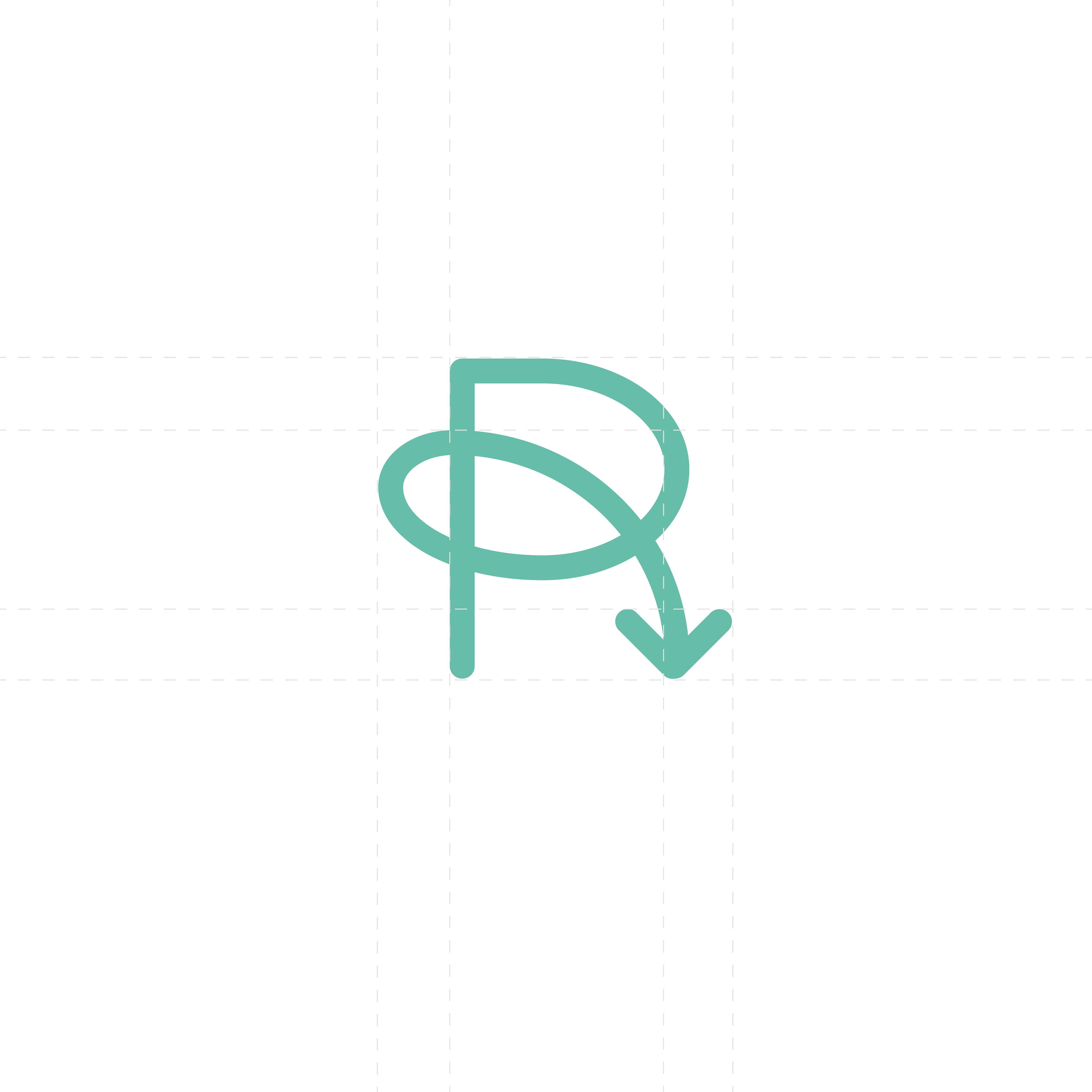
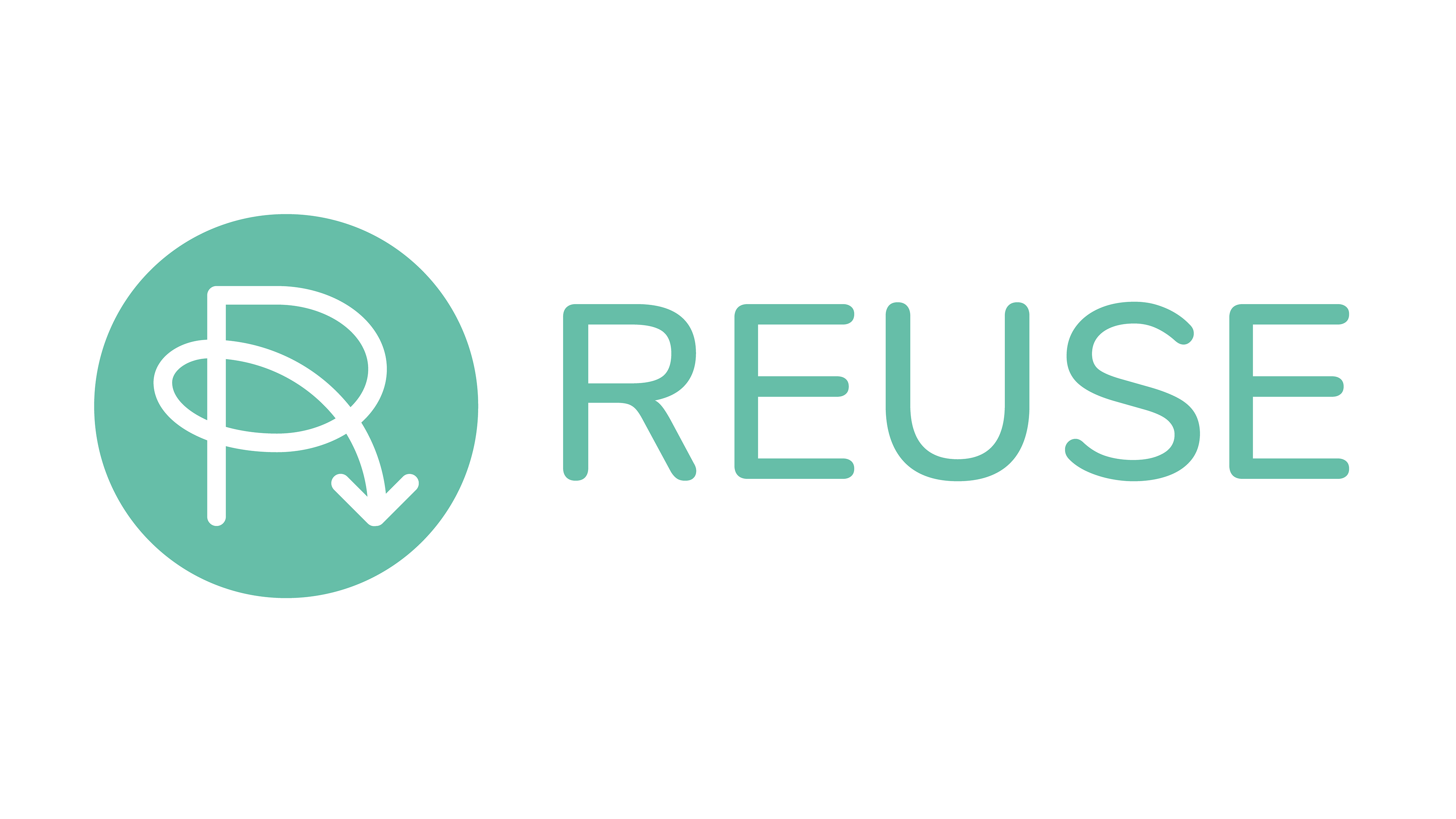
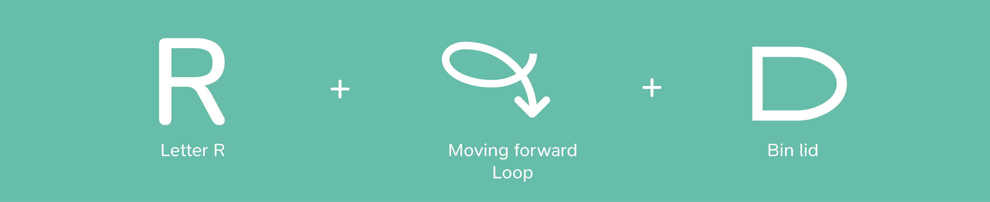
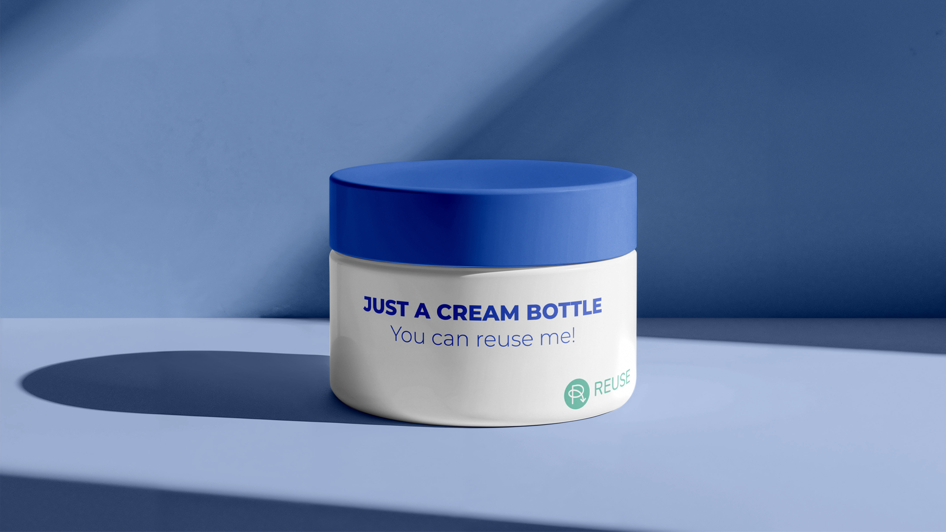
The reuse initiative and packaging that can be used again and again will transform daily life. When designing a reuse symbol, I wanted to embody this approach and ask the question: Why not reuse as much as I can during the design process? Recycling, reusing, repurposing, repeating, reducing. They all have one thing in common – the letter R. As the letter R is so ingrained in the concept of reducing waste and having a positive impact on the planet, I wanted to reuse it as the basis for my reuse symbol. My reuse symbol utilises a single arrow to draw the letter R. The upper loop of the R symbolises a bin. The arrow tip is an item that can bounce out of the bin, ready for another – yet different – cycle of use. Grab a pen. Draw the symbol using a continuous arrow. Once you have finished, draw the symbol again without removing your pen from the page. Repeat. You will find that it’s easy to redraw the symbol. However, each subsequent symbol will be slightly different, symbolising the new life we give to items when we reuse them. This iterative design effect is unique. My reuse symbol isn’t stuck in a loop in the same space, like recycling logos, but moves forward with each reused iteration. As the impact of reuse will be demonstrated to use through the colour of our waters, and our planet, the colour I’m proposing is aquamarine #2EE8BB.